Why Expedia's slow killing of their desktop web experience is not a good thing


TRIGGER WARNING: This post may include frustration towards recent changes made by Expedia.
Expedia has recently (in 2022) redesigned their user interface to provide a completely consistent experience between desktop web browser, mobile web browser, and their mobile app. This makes sense from a software development standpoint. After all, having a single codebase for all clients reduces complexity and enables them to rollout new features with less issues. This would also appear to make sense from a user experience standpoint (or so they say), particularly since customers these days now alternate between mobile and desktop transparently.
With responsive websites, mobile users are accustomed to more minimal and lighter interfaces, albeit at the expense of reduced options. Mobile users are now generally accustomed to this, if not expect it.
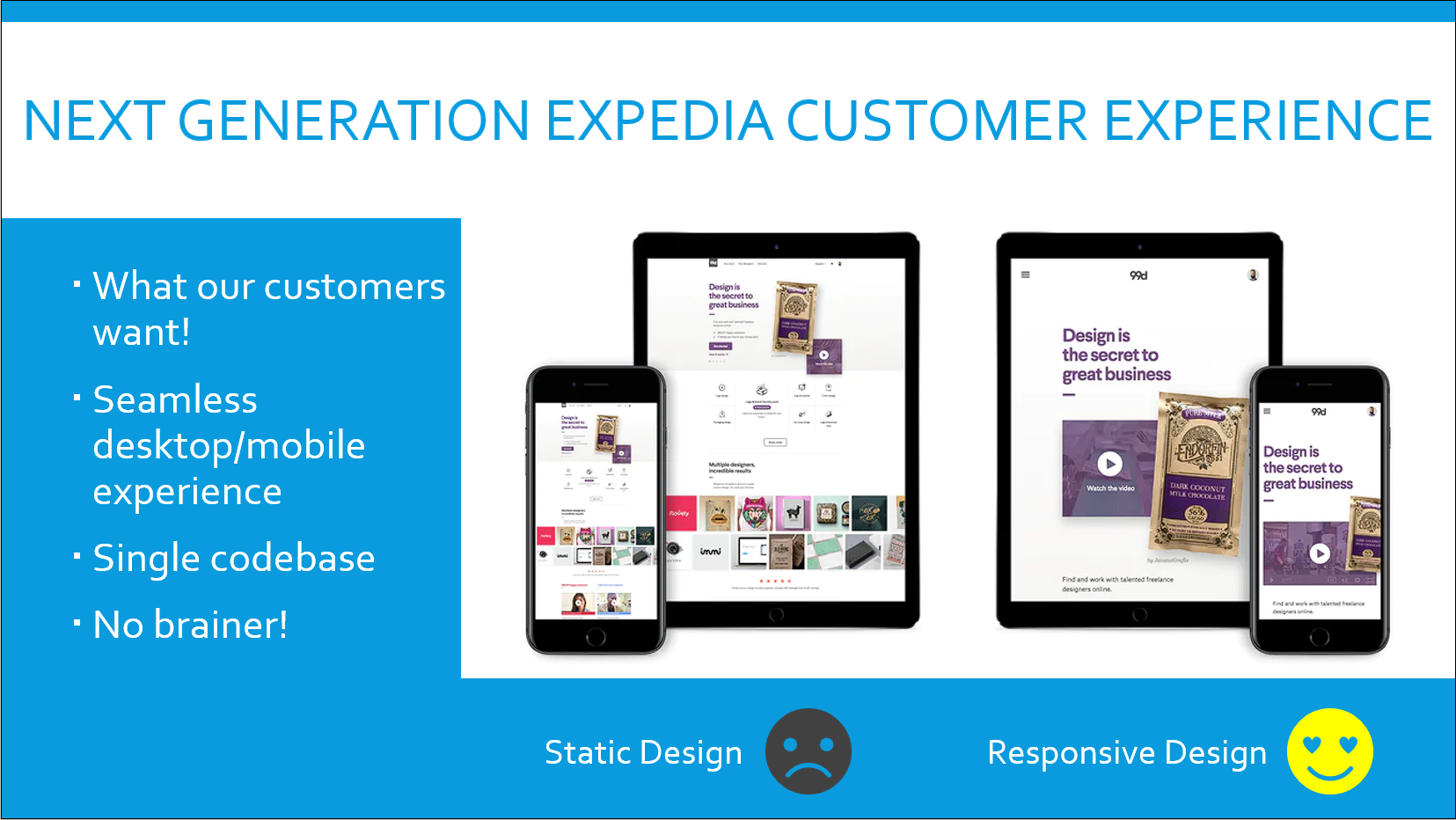
The IT hotshot who sold the concept of a unified interface to their executive leadership probably had a slide like this:
I'm not opposed to the recent changes. But Expedia failed in one key area. What Expedia did wrong was port the limitations of the mobile experience to the desktop web version.
Options and self-service capabilities on the desktop browser that existed in the older interface no longer exist. Others are now very difficult to find. Everything bad about the mobile browsing experience is now ported to the desktop version too.
Where Expedia Failed in their UI Redesign
The major failures in Expedia's recent UI redesign can be summarized as follows:
- Too little information in the desktop version. The desktop version displays less information than before, and is now similar looking to the mobile web and mobile app versions. Getting to a lot of information you need almost always requires engaging customer service (otherwise now known as the virtual agent).
- Excessive navigation required in the desktop version. The amount of navigation required to get to a feature or function in the new UI takes 5x more steps than the previous one.
- Functionality removed from the desktop version. Moving previously existing functionality from the desktop web application to the virtual chatbot has ruined the desktop experience.
- Loss of historical booking data that coincided with the UI redesign. It's unclear why Expedia did this, but customers have now permanently lost all previous booking data that pre-dated 2019. No warning was given to their customers.
- Less than ideal desktop UI. Awkward user interface, menus, and navigation riddle the desktop version. What works in mobile doesn't necessarily translate well in desktop.
The User Experience on Desktop is Downgraded
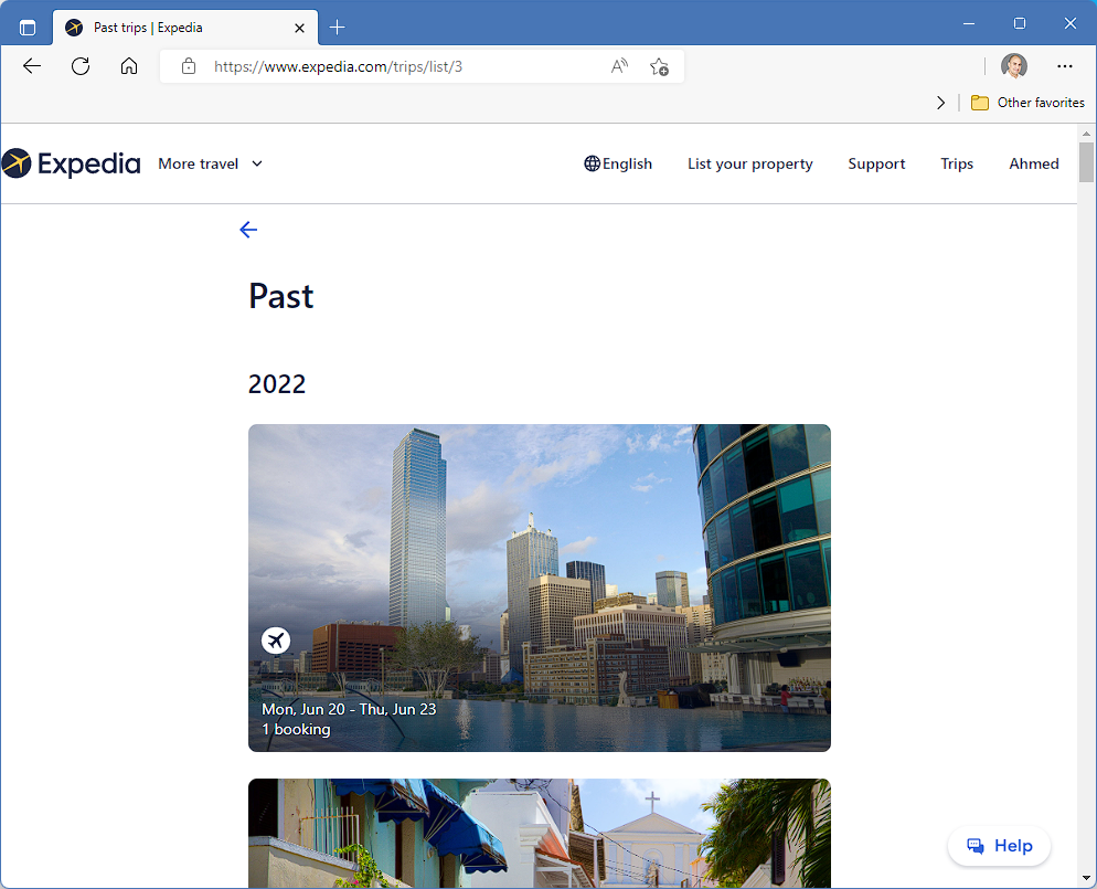
Do you know how long it now takes to get an invoice for a past flight on the newly designed desktop interface?
- Click on "Trips"
- Click on "Past"
- Click on the image of your trip (add a few more seconds if it's not obvious)
- Click on the departure flight
- Click on "Menu"
- Spend 30 seconds deciding if you should click on 'Print itinerary' or 'View as PDF' or 'View receipt'
- Click on "View as PDF"
- Click on the back icon
- Click on the return flight
- Click on "Menu"
- Click on "View as PDF"
Eleven steps. Unintuitive too. If I shared a screenshot walkthrough of how all this played out, likely you won't be impressed. In their older desktop interface, everything was streamlined on the desktop. Click on "Trips," select your trip, and "View Invoice." That's it. Simple and straightforward.
Desktop Self-Service Functions are Reduced
In the older desktop UI, you could email an itinerary to yourself. Now, that option is eliminated. You have to use a chatbot to do this.
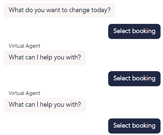
Let's see how many steps it now takes on the new desktop interface to email yourself an itinerary:
- Click on "Trips"
- Click on the image of your current trip
- Spend 1 minute clicking on the various menu options only to realize there's no way to email an itinerary to yourself
- Click on "Help" to launch the Virtual Agent
- Click on "Do something else" in the chatbot window when prompted
- Click on "Resend confirmation email"
- Spend 10 seconds trying to figure out how to scroll right on the upcoming bookings
- Spend 20 seconds to determine whether you should click 'See itinerary' or 'Select booking,' as all you want to do is email the itinerary
- Click on "See itinerary" and you're back on the same page
- Go back and click on "Select booking"
- Click on "Yes, send copy"
- Enter your email address again
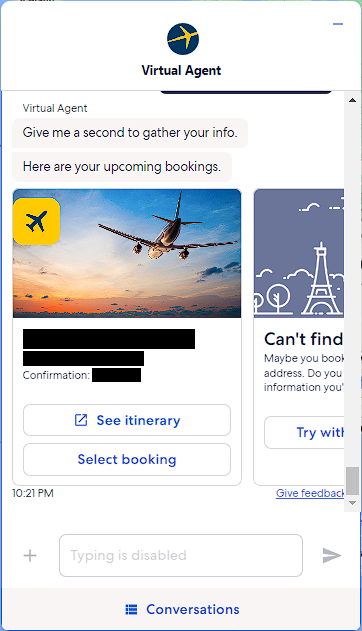
Take a look at this screenshot of the Virtual Agent. Turns out that the chat window is not resizable.
Expedia's Misguided Confidence in their "Virtual Agent"
Have you arrived at your destination and are having a problem with your car rental reservation? Have no worry! The Expedia virtual chat agent is here to assist! You're standing at the counter of the rental car agency and spending 2 minutes typing on your smartphone with an automated chatbot. What fun!
I looked up my history of chats. It consistently takes 2 minutes to get to a live agent on chat (remember, this is text chat, not phone). Now mind you, this may not sound like a long time. But now imagine a line behind you and a tired family, all while you're unsuccessfully trying to get hold of a human agent... for 2 minutes straight.
It takes an average of 20 minutes to get a simple question answered. Mind you, this is typing on your smartphone and waiting, often minutes, to get a response to each message you send.
Most of Expedia's customer support is based in the Philippines and Egypt. If you thought it was challenging working with an offshore support agent before, wait till you start texting them!
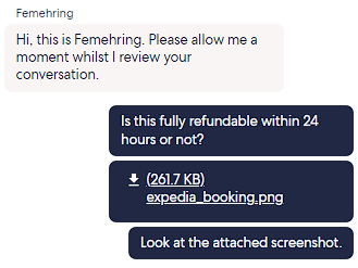
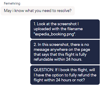
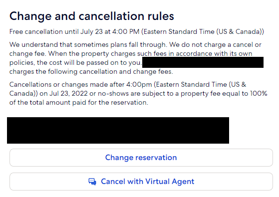
In this next screenshot, all I wanted to know was whether the flight I was about to book was refundable. This only required a 35 minute (11:03pm to 11:38pm) virtual chat with Ayman to get the question answered. To be fair, he was quite knowledgeable but I did have to repeat and rephrase some questions, likely due to a language barrier.
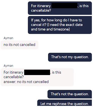
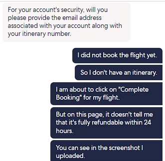
It takes longer to explain the situation on chat, and repeat clarification is almost always needed, as was the case with Femehring. I even provided a screenshot in the beginning of the chat to try to avoid any confusion!
I frequently needed to further clarify to Femehring what I'm needing help with.
So he answers my question. But remember, I've been using Expedia well over a decade, so I'm reasonably familiar with the policies. Femehring, my friend, I'm pretty certain you're wrong here.
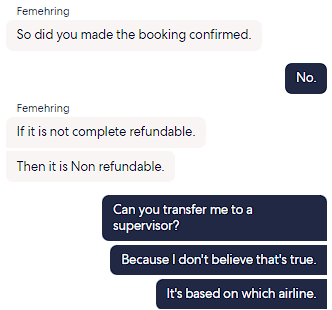
Femehring claims he's "well equipped" to handle my inquiry and felt that it wasn't necessary to transfer me to a supervisor, so let's see when I present him with hard evidence disputing his previous statement.
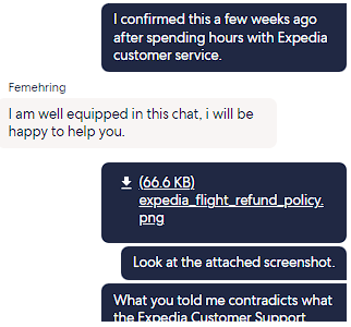
This is the third time I'm explaining the situation to try to get an answer to my single question.
I get that English may not be the first language of many of these agents, but a 35 minute text chat could have concluded in no more 5 minutes on the phone.
My Final Thoughts
Are these problems simply the growing pains of deploying new interfaces, functionality, or chatbots?
Are the UI redesign decisions that Expedia made simply where everyone is headed? I sure hope not. Responsive web design doesn't restrict usability. Lazy development does.
While it's essential to remove clutter in mobile to improve readability, mobile still requires all features that its desktop counterpart offers. However, Expedia took the opposite route of eliminating the features on the desktop version instead. To compensate for these limitations, they aggressively pushed their virtual agent (aka chatbot) onto their customers as a means to obtaining whatever information is missing. Removing previously existing functionality and pushing it to a mediocre chatbot is simply a poor design decision.
I'm mindful of the challenges recruiting and maintaining human talent the past few years, and perhaps Expedia thought that chatbots were a means to addressing the lack of staff. This is likely not their reasoning, because I spend more time with their human agents on the virtual agent than I ever did on the phone.
What Expedia did was simply make bad technology decisions that are negatively affecting their users' experience. I've spent over 20 hours virtual chatting with their agents over the last two months because of the endless limitations and challenges that I've been running into since their new UI rollout a couple of months ago. This is simply unacceptable.
I've been loyal to Expedia, but now am questioning how long I can tolerate these bad decisions.
Update July 16, 2022
Wth?! I went to cancel a hotel reservation (I'm on my desktop), and Expedia is forcing me to navigate to the virtual agent to cancel! Why not simply give me a Cancel option similar to how you have the Change reservation option? I honestly don't get it.
Granted the entire process took 3 steps, but now I have to read every single word from the virtual agent which is attempting to mimic human dialogue as best as possible (meaning I have to be extra careful before confirming an activity). I still had to open another window and view the itinerary to confirm the amount refunded to the original amount charged.
If anyone has any suggestions to an alternate online travel agency that I can spend my hard earned money on for the next 10 years, please let me know. I'm fed up with Expedia forcing the virtual agent on me for the most basic actions (which happen to be the most frequent too).
Update July 18, 2022
Amazing!
Expedia finally allows you to cancel a flight through the desktop browser! And it only takes 1 click!
Do you know how many times I've engaged the awful virtual agent to try to find out how much time I have left to cancel my flight within the refund window? The agents could never tell me when, and I've had multiple frustrating discussions with them, often exceeding 45 minutes, just to try to get an answer (I was never successful).
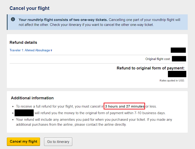
Credit to Expedia for fixing their issues. Shame on them with making the awful design decisions in the first place.
To be continued.